
In Endrava, we’re passionate about greenhouse gas emissions (GHG). More specifically, cutting those emissions in the best way possible. With CaptureMap, we often get caught up in looking at sites or segments individually, but in this blog post we wanted to use the tool differently. In this article we provide an overview of CO2 emission trends, based on the 11 years of historic data that we have for most sites in the database. We want to show how different segments are evolving over time. In that way, we can also indicate those that seem to be reducing their emissions versus those that are not.
Leading up to COP27, we hope a few decision makers will take these insights with them into the negotiations. In short, we have some work left to do.
Contents
CO2 emission trends for selected segments
As a starting point, we’ve chosen the seven largest emission segments in CaptureMap. By largest, we mean the sum of total CO2 emissions from each segment from 2010 through 2021. Together they represent about 95 % of the total CO2 emissions in our database, see diagram below.

We’ve then decided to look at the 20 largest contributors to the emissions within each segment, and use that as an indicator for overall sector evolution. This is far from a perfect approach, but we like to think that we need to cut emissions where it counts. That typically means going after the big facilities. Read more in the methodology section below for details on how we’ve set up this analysis.
We’ve listed the different segments, with a brief description of what’s included, and the total annual emissions charts, below. Notice that we’ve shown the CaptureMap Facility IDs specifically (with first three letters for country code), so you can go check them out yourselves. And this is part of the point: when we’re talking about emission reductions for large, point source emitters, these very sites need to do something.
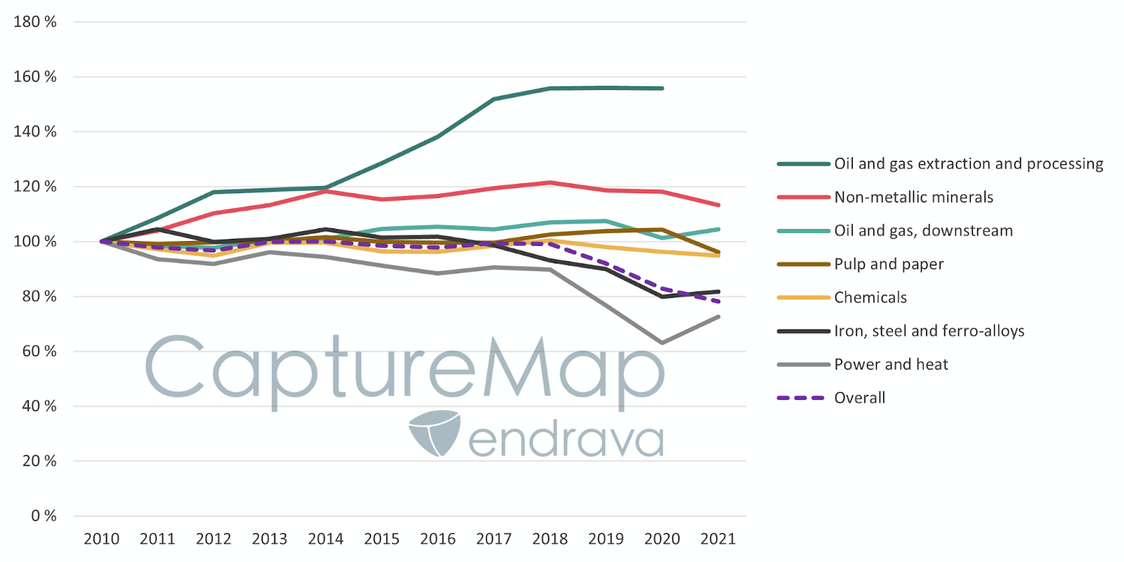
Power and/or heat plants, often coal, lignite and natural gas based. A 27 % reduction in the period.

Iron, steel and ferrous alloys, mostly manufacture of basic iron and steel and ferro-alloys in blast furnaces, steel converters, rolling and finishing mills, production of ferro-alloys, pig iron, etc. An 18 % reduction in the period.

Oil and gas downstream, mostly refineries with manufacture of fuel, lubricants, products for the petrochemical industry, and other various products. A 4 % increase in the period.

Chemicals, typically manufacture of ammonia, hydrogen and other industrial gases, ethanol, plastics, ethylene oxides. A 5 % decrease in the period.

Oil and gas extraction and processing, extraction of oil and gas including both onshore and offshore facilities. A 56 % increase in the period.

Pulp and paper, manufacture of pulp, paper and board. A 4 % decrease in the period.

Non-metallic minerals, manufacture of cement, lime and plaster, glass and glass products. A 13 % increase in the period.

A mixed picture for the overall trend
So how do the different industry segments compare on the overall? Well, it’s a mixed picture. Some segments, like oil and gas extraction and processing as well non-metallic minerals have seen an increase in their emissions for the 20 largest sites. On the other hand, power and heat as well as steel and ferro-alloys have reduced emissions for the 20 largest sites.
What we don’t know is whether these changes are due to changes in output, processes or a combination, and whether the changes are permanent or temporary. In particular, we’re quite wary of thinking that changes in 2020 and 2021 are permanent given COVIDs impact on society.
The figure below illustrates the indexed evolution of these seven segments, where 2010 is the indexing year. Take note that we cannot infer from this data alone that the segments as a whole are doing the same thing. That said, it does point to some interesting trends. Maybe we’ll have a correlation blog post later to see how the performance of the top 20 sites correlate with the segment as a whole.
Concluding remarks
Data is fun. Data used for insights is even better. In this article, we’ve tried to slice the data in CaptureMap differently to understand segment GHG emission performance over time. The point is not to name and shame, but rather draw attention to the fact that these segments are important emission categories. More specifically, these particular sites will need significant decarbonization in the time to come. An interesting side note: on an annual basis, the top 10 facilities in our database alone emit more than 3 times Norway’s total emissions.
What we’re not capturing (pun intended) here is also important. First, we use data for the 33 countries we have in our database, including the United States, Canada and most of Europe. We therefore don’t have insights into what happens in other parts of the world (but we’re working on it!). Second, we’re only looking at large, point source emitters. Transportation, agriculture and LULUCF are examples of sectors not included in CaptureMap, but these also have large GHG emissions associated with them. Finally, we’re not able to give credit to the many facilities that are in the midst of planning ways of decarbonization. We only get to report on the results so far. And we think the real proof is in the (reported emissions) pudding.
Thankfully, past performance is no guarantee of future development. If you’re reading this blog, it’s time to roll up the sleeves.
Methodology
Our analysis can make any reader think of a good bunch of ifs and buts. It’s certainly true that we’ve had to make some methodological compromises. Our database is an aggregation of many public data sources, in which we apply advanced analytics to clean, harmonize, standardize and combine datasets. Do you think this is simply a matter of ctrl-c and ctrl-v? We urge you to read this blog post about the inner workings of one of the databases we use. In short, it’s not that easy, and something that makes CaptureMap stand apart from what else is available on the market.
Altogether our database now contains asset-specific information for more than 10 000 sites, across 33 countries, and often with 10 years of history. We also have biogenic information, and often Emission Trading Scheme credits, so it’s starting to become a pretty hefty set of data points.
To keep things manageable for this blog post, here’s what we’ve done:
- Select the seven largest segments within CaptureMap, based on the sum of biogenic and fossil emissions for each segment from 2010 up to 2021. These seven segments represent 95 % of the total emissions in our database.
- In each of the seven segments, select the 20 largest sites, based on their total emissions output in the period 2010-2021. There are occasionally sites that have discontinued reporting in this overview and we’ve not made any corrections for that. Still, nearly all of them have remained operational in the period with reported emissions data.